
Why Colour Harmony Matters: The Design Logic Behind Matching Blinds and Wall Colours

Why Colour Harmony Matters
We used to think blinds were just functional. A way to block light and add privacy.
Colour felt like an afterthought. Something neutral. Something "safe."
Then we realised blinds could do more than blend in. They could elevate a room.
A perfectly chosen blind doesn't just match the wall. It complements it, contrasts it, or anchors the whole space with deliberate balance.
That's when colour harmony stopped being decorative and started feeling like design intelligence.
The Design Logic Behind Colour Pairing
Matching blinds to wall colours isn't about picking "the same shade." It's about managing tone, depth, and light.
These three factors dictate whether a room feels cohesive or chaotic.
Here's how the relationship actually works:
1. Tone Connection
Every colour has an undertone. Cool (blue, grey, green) or warm (yellow, red, brown).
Your blinds should echo that undertone, even if the shade itself differs.
Cream walls with honey-toned blinds feel soft and sunlit. Grey walls with slate blinds feel architectural and composed.
2. Depth Balance
If your walls are light, deeper blinds add structure. If your walls are dark, lighter blinds bring relief.
This balance creates visual rhythm. The kind of subtle contrast that feels effortless but intentional.
3. Light Interaction
Fabric translucency affects colour perception.
A sheer white roller blind diffuses sunlight into a cool glow, while a textured beige fabric warms a room instantly.
The way light passes through or across your blinds changes everything.
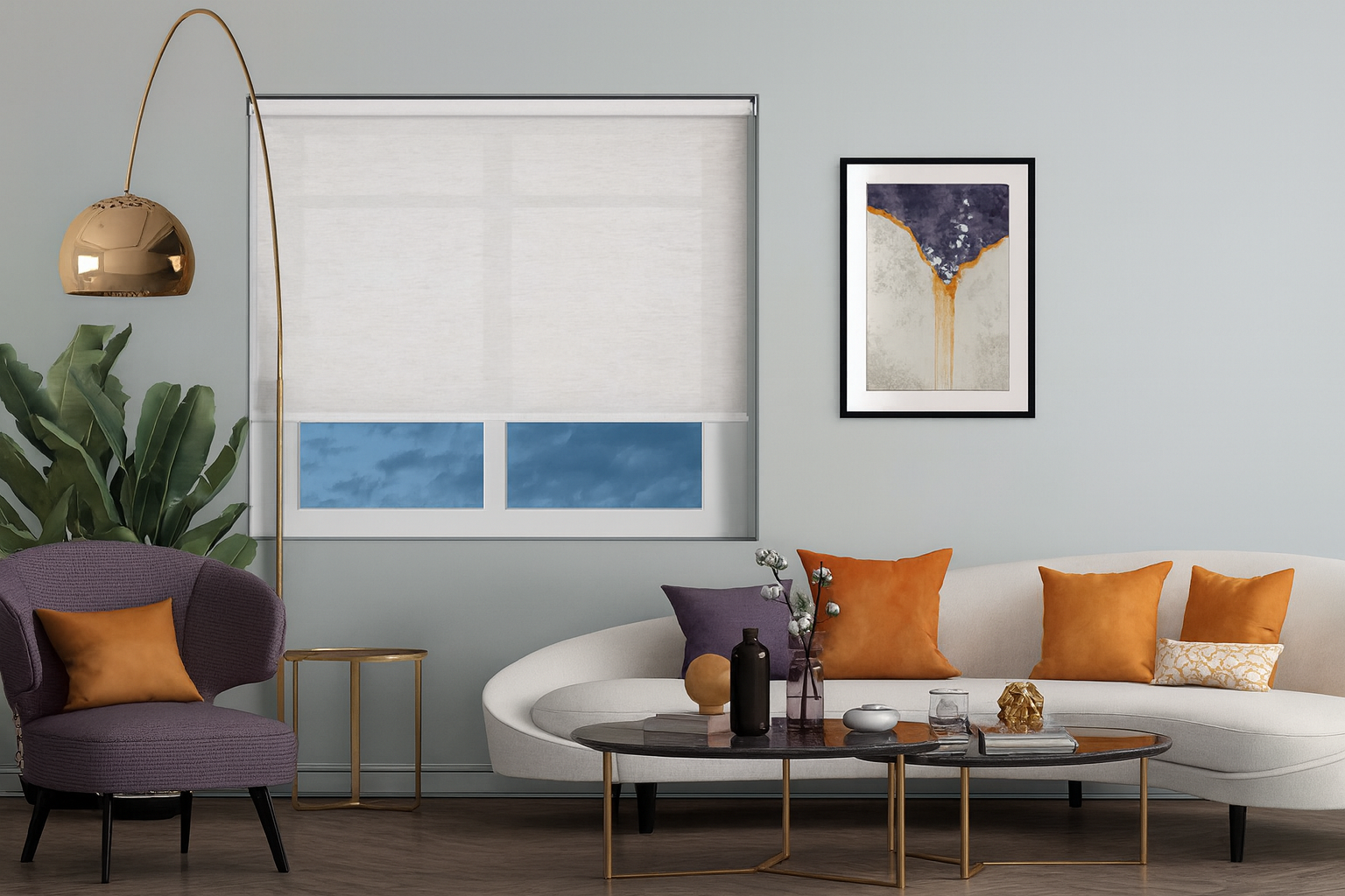
Real Examples of Colour Pairing That Work
Soft Neutrals
Stone, oatmeal, or sand walls pair beautifully with taupe or mushroom blinds.
The look feels organic. Minimalist without being sterile.
Cool Modern Spaces
Pale grey walls find balance with charcoal or steel blinds.
Metallic accents or matte finishes help tie in tech-led interiors.
Warm Traditional Rooms
Terracotta or clay walls with mocha or walnut blinds feel rich and grounded.
These combinations echo natural warmth. Ideal for heritage homes or cosy spaces.
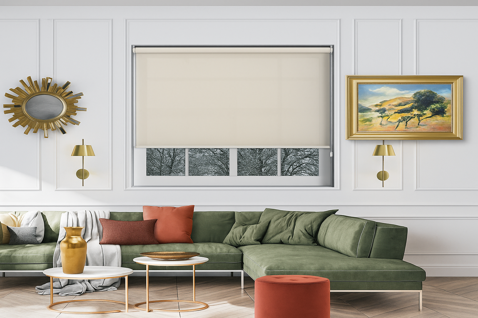
Clean White Interiors
White walls give you freedom.
Contrast them with navy, olive, or charcoal blinds for a gallery-style aesthetic. Or keep it tonal with white-on-white texture to amplify light.
Textures That Tie the Palette Together
Colour isn't the only match point. Texture creates harmony when tones diverge.
A linen-effect roller blind introduces tactile warmth to crisp painted walls.
Wooden or faux-wood blinds mirror natural grains from flooring or furniture, visually linking wall colour to interior finishes.
Velvet and thermal fabrics deepen tone perception, making pale colours appear richer and more intentional.
Texture bridges the gap between similar colours that might otherwise feel flat.
The Psychological Edge of Colour
Colour isn't decoration. It's mood engineering.
Cool tones calm and expand. Perfect for bedrooms and offices.
Warm tones comfort and energise. Ideal for living spaces and kitchens.
Earth neutrals create balance and focus, fitting nearly any palette.
Choosing blinds that reflect your desired mood ensures the space feels right. Not just looks right.
Bringing It All Together
The perfect blind colour doesn't happen by accident. It's a conversation between surface, light, and emotion.
When you align undertones, balance depth, and consider light flow, your blinds stop being accessories. They become architectural features.
Every window becomes part of the design story rather than a visual interruption.
At Lifestyle Blinds, we've spent over 20 years understanding how made-to-measure window treatments complete a space. The right blinds don't just cover your windows—they compose your room's visual rhythm.
Made to Measure Window Blinds UK | Lifestyle Blinds
At Lifestyle Blinds, we believe the right made-to-measure window blinds do more than cover your windows — they complete your home's style, enhance energy efficiency, and deliver real functionality for modern living. With over 20 years of industry experience, we have proudly served homeowners across the UK with a carefully curated range of made-to-measure blinds, combining design flexibility, premium quality, and excellent value.